graphic by @Alison Vinciguerra
Whether you are surviving the Polar Vortex or enjoying a balmy El Nino Spring, new collections will be on their way to stores soon! To help inspire you on what new shades to invest in we've created a Pinterest Board with a breakdown of the top new colors will be in stores this spring.
This year the color palette focuses on tranquil calming shades infused with a few happy candy colored pops. Here is a link to our Pinterest Board to explore more.
Stay Stylish,
K&M
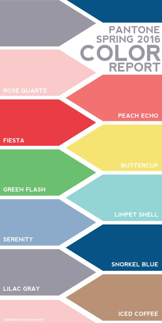
Top Five Pantone Colors Used in 2016 Collections according to WWD:
1. Rose Quartz 13-1520 Percentage of designers who used this color: 22.55
“This really is a beautiful pink that will radiate well on the skin for women as well as men,” Eiseman said.
2. Peach Echo 16-1548 Percentage of designers who used this color: 19.87
Peach Echo is a very warm, friendly and accessible color,” Eiseman said.
3. Serenity 15-3919 Percentage of designers who used this color: 15.86
“As the name suggests, Serenity is a calming color that plays to the whole idea that we know we’re still living in turbulent times.” Eiseman said.
4. Snorkel Blue 19-4049 Percentage of designers who used this color: 15.21
Eiseman said this shade is “meant to be a bit more fun, less serious than navy, and serve as one of the anchor colors for the spring palette.”
5. Buttercup 12-0752 Percentage of designers who used this color: 11.45
“Buttercup is all about sunlight, happiness and cheer — ” Eiseman said.
To read the full of the WWD Article click here.